

LEAGUE OF LEGENDS CLIENT REDESIGN
A self driven client redesign challenge to enhance creative construction and feel of the League of Legends client design. In this challenge, I focused on the player profile and player expression systems to promote new ways for players to express themselves visually while playing. Took about 3 days to complete.
Note: This is done out of pure love for League of Legends and Riot Games’ work. These are mere ideas, not solutions.
PHASE 1: Understanding the Assignment

First, I wanted to set limitations in what I can do in this challenge in order to not overstep current design philosophies.
I will NOT bring in new assets that do not exist in the game/ client ecosystem already.
I will NOT change any current shape language, only enhance its use.
I will adhere to League’s style guides as much as possible. (which are luckily available for download)

Second, I wanted to outline my goals for the design and scope of my work to find out precisely what I wanted to fix and improve.
Redesign Goals:
Synthetize and make the visual language more consistent across different parts of the design.
Make a more interactive profile page to proudly present player achievements and collection.
Offer more customization options for player in game banner based on existing methods.
PHASE 2: The Hextech Dream

BEFORE
Building the main profile page and top UI bar proved to be the bulk of the new design. I decided to build upon the old rather than scrap all of it, utilizing some of the existing functionality to offer something more… unique?
Another path I arrived to is to reduce the number of clicks one must make an edit on the profile and make the whole look contain the steampunk magic that Hextech holds.
Some changes include removal of the profile flags, creating a collapsible social tab on the right side to free more screen architecture and a shift to a textured, not image overlayed backdrop to most areas.
Upon first implementation, I experimented with squares and rectangles but landed on circles, hexagons (obviously) and accented lines to display a more futuristic look reminiscent of Arcane. I quickly reorganized the existing information on the page and implemented the new core feature of the profile, The Mastery Carousel.
This magical circle of awesomeness will allow one person to:
Cycle through a player’s top 3 champions, displaying their mastery and eternals progression.
Display their favorite skins for those champions, perhaps even sound a impressive voice line.
Allow a player to pick and upload their biggest brain outplay as a Mastery Highlight to wow their teammates.
AFTER

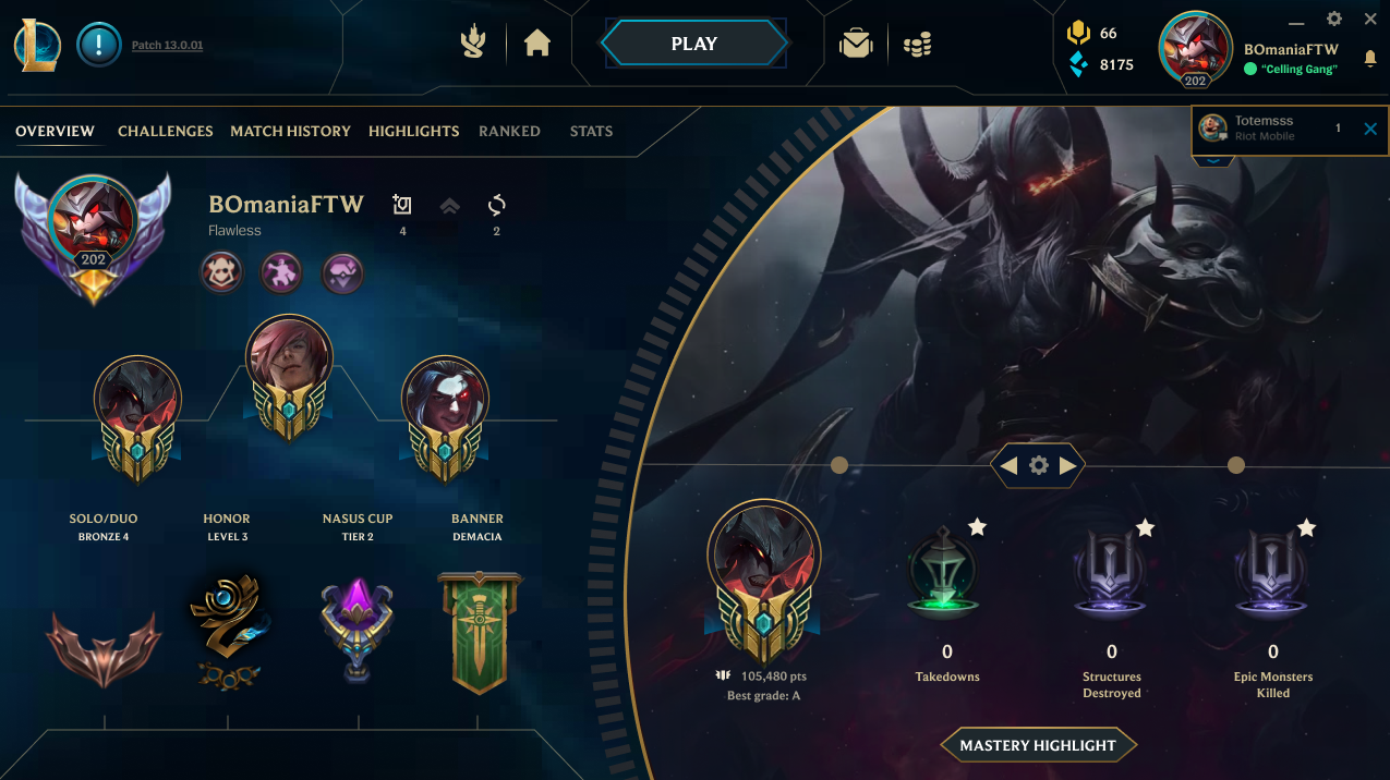
I think this provides the most opportunities to display visually the type of player that one deals with including their rank, level, top champions used and selected challenge tokens. This takes the best of what already was and enhances it to add more visual clarity, lack of overlap of textures which was highly prevalent in the previous design. All customization could be accessed through the gear icon or pressing on any editable icons.
My second feature introduced is a more collective player banner that encompasses some of the more dreadfully underutilized assets in League of Legends. The skin frames, champion skins and banners.
Currently, skin frames only activate when the right champion (character), while the right skin is in play. Which means the only possible way to see the frame is in the game loading for about 10-20 seconds. To give more incentive for players to spend their event tokens on the frames, I implemented a more consistent player card that would showcase a player’s signature skin, their ranked banner, and a chosen event frame all at once.
This card will be displayed in the loading and party screens (unincluded in this challenge.)

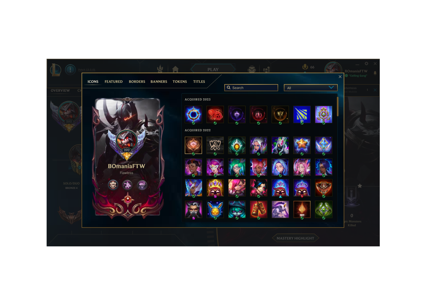
Finally, to drive all that customization into one uniform place, I reorganized the customization pop up screen to include everything from banners, featured champions and more.
BEFORE

AFTER

BEFORE

AFTER

PHASE 3: Consistency for Champions
Finally, I wanted to bring some much needed consistency to familiar screens and how they display, scroll and select materials. As well as optimize the screen to normalize full screen resolution, which is consistent with newer Riot products like Valorant and Legends of Runeterra. I took many elements present in the new additions to the roster including the challenges and titles pages and set that as the standard going forward.
I also wanted to aim to be able to display more information with less scrolling necessary to take advantage of the full screen resolution I was working with.
BEFORE

AFTER

BEFORE

AFTER

With these additions, I followed through with the design focusing on:
Giving more use and completing the design of the Highlights screen which now displays champion played and allows for easier renaming and setting of mastery highlights.
Reorganizing the match history screen to display more needed information such as key runes, replay and record functionality to highlights and stats such as win rate and average KDA.
Made all screens with consistent hover effects and cosmetic elements to emphasize the “Hextech Dream” theme.
League Client Redesign Gallery


PHASE 4: OUTCOMES AND LEARNINGS
It was an amazing experience working on this project. It was the first redesign of a known IP that I have done and I really HOPE I did it some justice. It isn’t complete by any means but perhaps if I continue to work on it, continue to iterate and improve it could be something awesome.